Have you ever stood in front of an abstract painting feeling completely lost, wondering if you’re missing something obvious that everyone else seems to understand? That moment when you think ‘my five-year-old could paint this’ while secretly worrying there’s some deep meaning you’re failing to grasp? I’m Oleg G. from Art Explained Simply & Quickly, and today I’m giving you the tools to confidently read abstract art – no art degree required. By the end of this video, you’ll never feel intimidated by a Jackson Pollock or confused by a Kandinsky again.
Here’s the secret art galleries don’t tell you: there’s no single ‘correct’ way to interpret abstract art. The anxiety you feel comes from thinking there’s a hidden code you need to crack, but abstract art is actually designed to speak directly to your senses and emotions, bypassing your analytical brain entirely. Let me show you how to unlock this visual language.
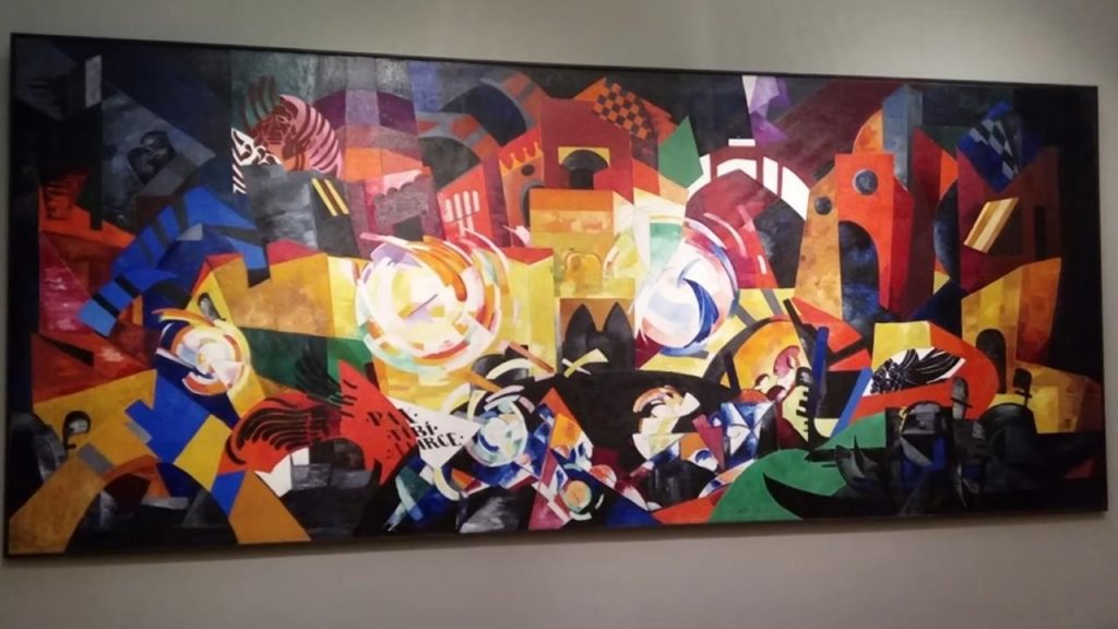
First, let’s destroy the biggest myth about abstract art – that it’s random or meaningless. Every mark, every color choice, every compositional decision is intentional. Abstract artists aren’t throwing paint around hoping something sticks. They’re using visual elements – line, color, shape, texture – as their vocabulary to communicate ideas and emotions that words can’t capture.
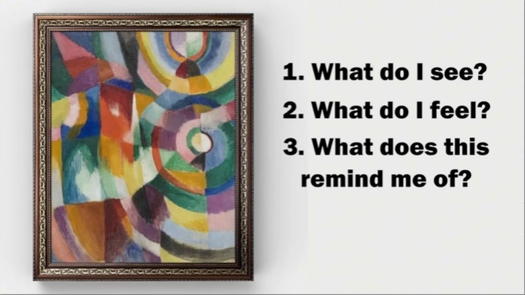
Let’s start with the fundamentals. When you approach any abstract work, begin with three simple questions: What do I see? What do I feel? What does this remind me of? Don’t overthink these responses – your first instincts are often the most valuable. Your brain is incredibly sophisticated at reading visual information, even when you’re not consciously aware of it.
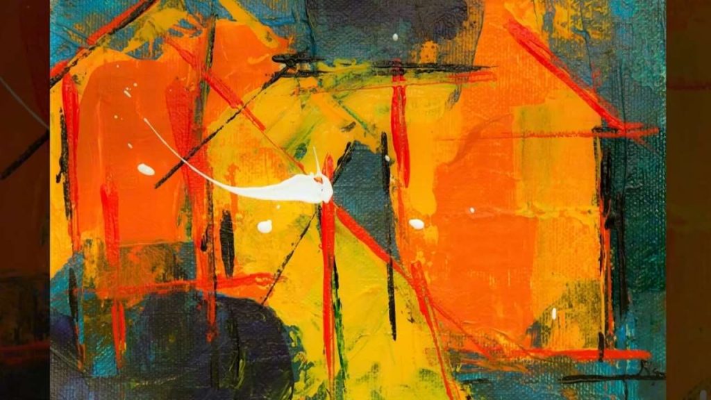
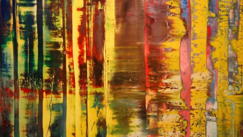
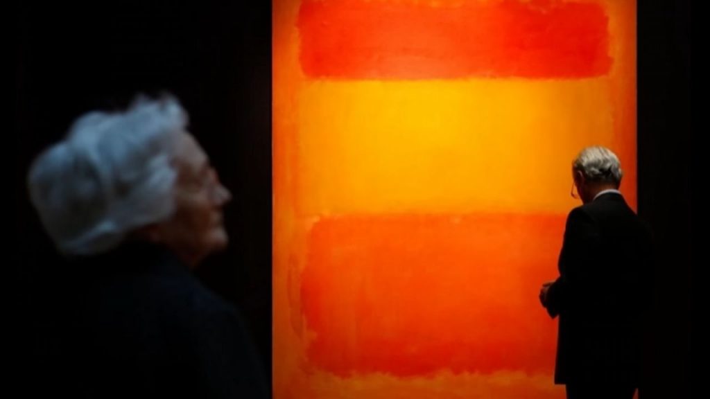
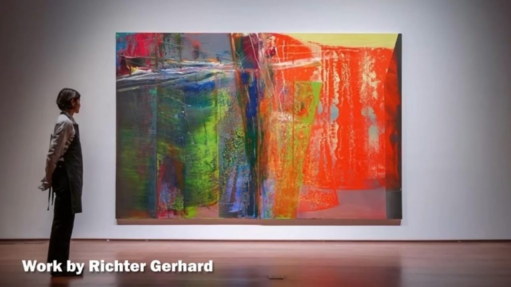
Take color, for instance. You already know how to read color emotionally. Red can feel aggressive, passionate, or warm. Blue might seem calm, cold, or melancholy. Yellow often appears energetic or optimistic. Abstract artists use these color associations deliberately. When Mark Rothko paints those massive red canvases, he’s not just decorating – he’s creating an emotional environment, surrounding you with the psychological weight of that color.
But here’s where it gets interesting – context changes everything. A red that feels violent when paired with black might feel joyful when surrounded by yellow. Abstract artists are master psychologists, understanding how colors interact to create complex emotional experiences. When you look at an abstract painting, notice not just individual colors but how they make each other feel.
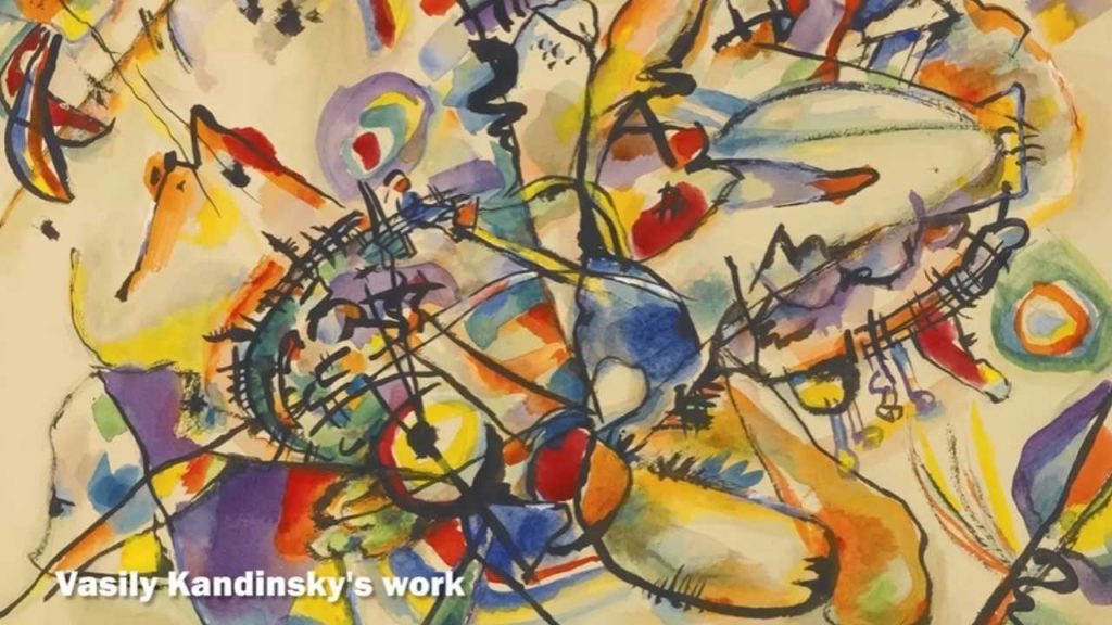
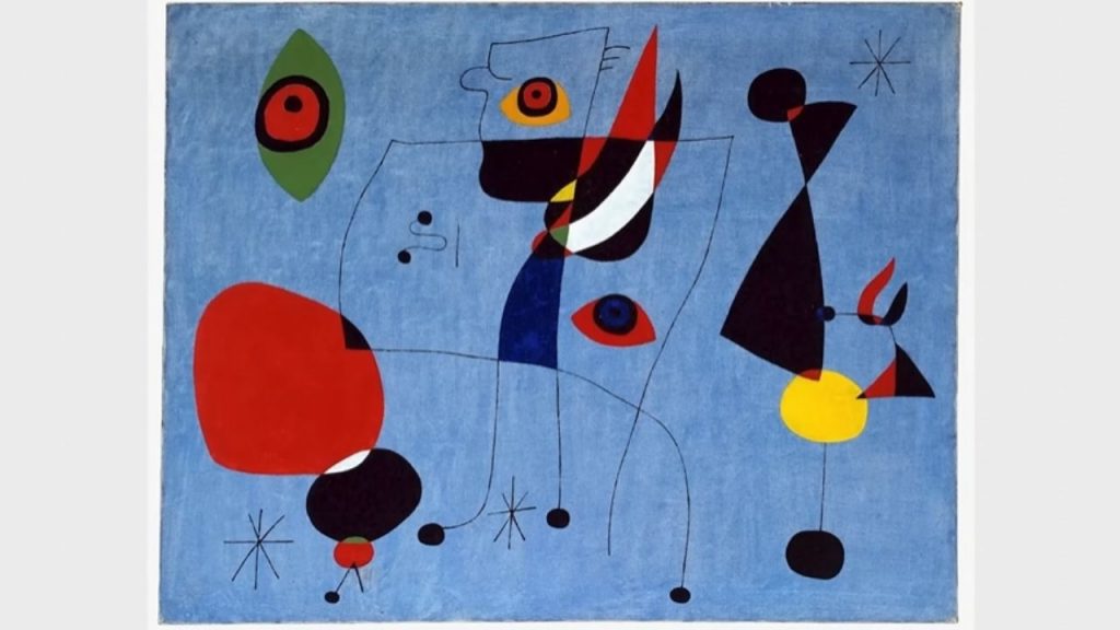
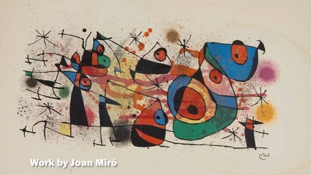
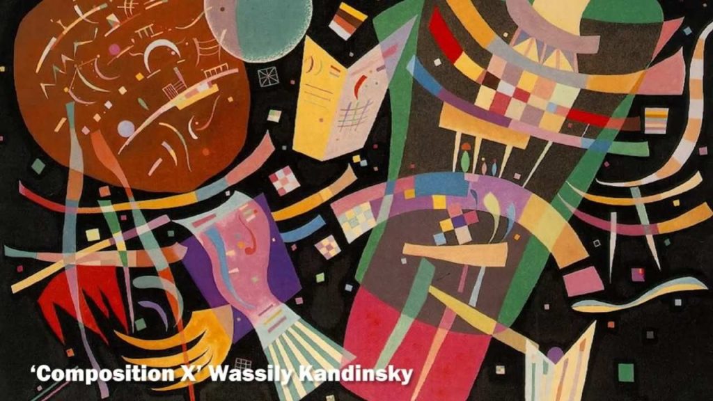
Shape and form carry meaning too. Sharp, angular forms often feel aggressive or dynamic, while curved, organic shapes seem gentle or flowing. Think about how you naturally describe personalities – someone might have ‘sharp edges’ or a ‘soft demeanor.’ Abstract artists use these same associations. Kandinsky believed triangles were aggressive, circles were peaceful, and squares were stable. You don’t need to know his theory to feel these differences.
Line quality reveals the artist’s energy and intention. Rough, scratchy lines suggest tension or urgency. Smooth, flowing lines feel calm or controlled. Think about handwriting – you can sense someone’s mood from how they write. Abstract artists use line the same way, leaving traces of their physical and emotional state in every mark.
Let’s talk about composition – how elements are arranged within the frame. A composition that feels balanced and symmetrical often creates calm, while asymmetrical arrangements can feel dynamic or unsettling. Notice where your eye goes first, how it moves around the painting, where it wants to rest. Artists control this visual journey deliberately.
Scale and proportion matter enormously. Standing in front of a massive Barnett Newman painting creates a completely different experience than viewing a small Paul Klee. Large works can feel overwhelming or enveloping, while intimate pieces invite closer, more personal engagement. Artists choose their scale to create specific psychological effects.
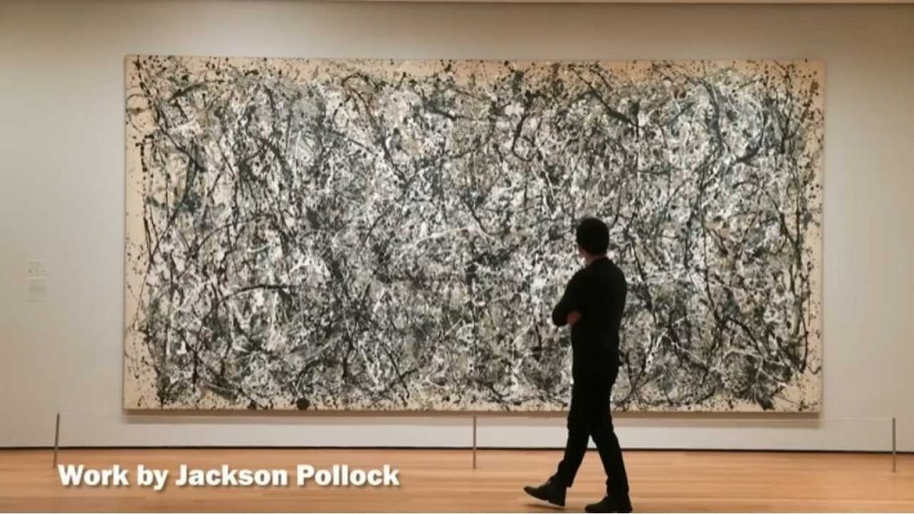
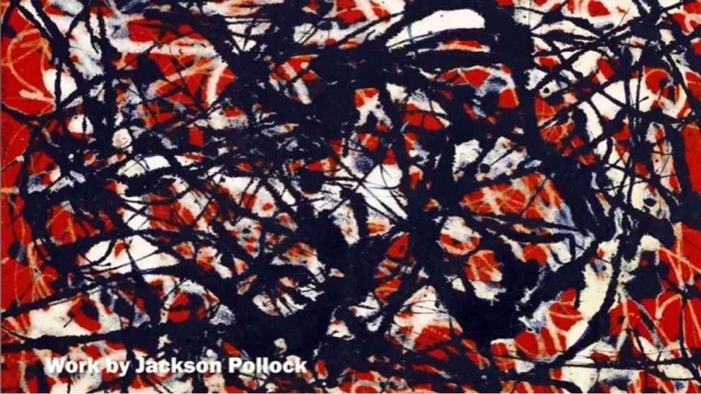
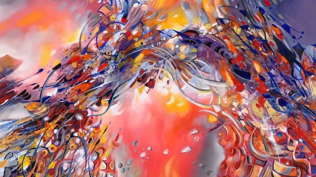
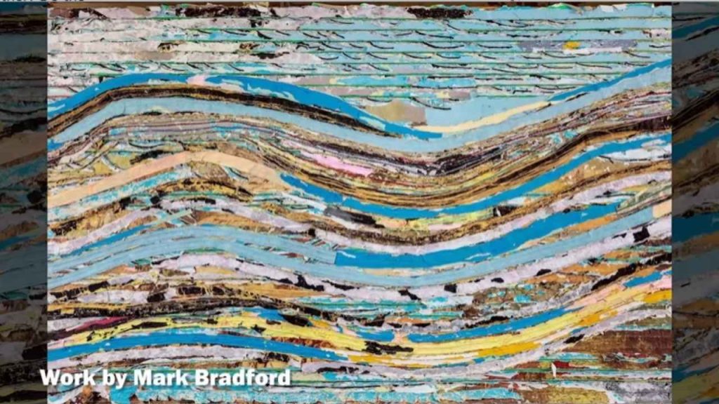
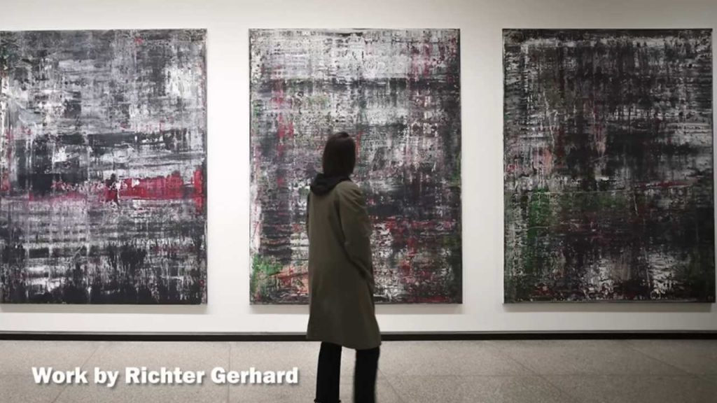
Texture adds another layer of meaning. Thick, impasto paint that you can see and almost feel suggests different emotions than smooth, flat surfaces. Pollock‘s dripped paint creates texture that’s both chaotic and rhythmic. Rothko‘s thin washes create surfaces that seem to glow from within. These textural decisions affect how the work feels, not just how it looks.
Now let’s practice with specific approaches. Try the ‘weather method’ – if this painting were weather, what would it be? A gentle spring rain? A violent thunderstorm? A crisp winter morning? This metaphorical thinking helps you access the painting’s emotional content without getting caught up in trying to find hidden meanings.
Use the ‘music method’ too. If this painting were music, what would it sound like? Jazz improvisation? Classical symphony? Heavy metal? Electronic ambient? Abstract art and music are closely related – both use non-representational elements to create emotional experiences over time.
The ‘movement method’ is particularly powerful. How would your body move if it were responding to this painting? Would you dance slowly and gracefully? March aggressively? Sway gently? Abstract art often captures movement and rhythm, and your physical response can reveal meanings your conscious mind might miss.
Let’s address the elephant in the room – what about completely non-objective art that doesn’t seem to reference anything in the real world? This is where many people panic, but it’s actually where abstract art becomes most powerful. These works operate like music – they create experiences through pure visual relationships without needing to represent anything external.
When viewing purely abstract work, focus on relationships. How do the colors relate to each other? Do the shapes seem to be in conversation or conflict? Does the composition feel like it’s moving or static? These relationships create meaning just as surely as recognizable subjects do.
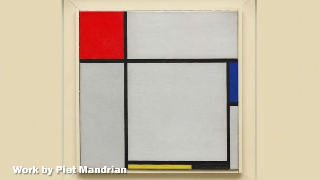
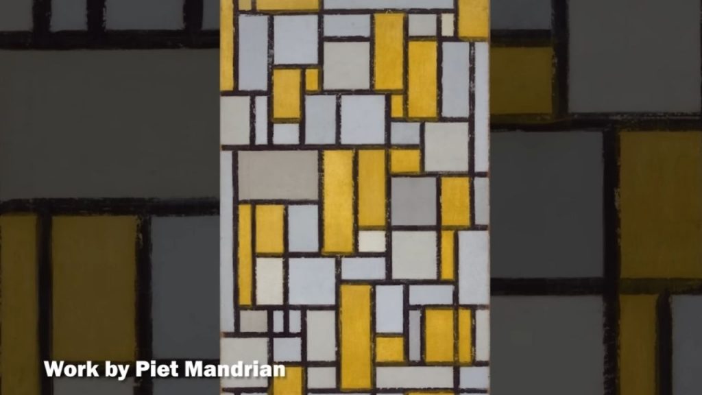
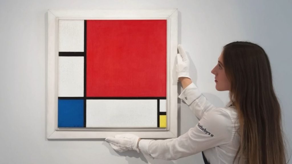
Historical context can enrich your understanding without being essential. Knowing that Mondrian was seeking spiritual harmony through geometric perfection adds depth to his grid paintings, but you can appreciate their calm, ordered beauty without that knowledge. Knowing that Abstract Expressionists were responding to World War II trauma helps explain their emotional intensity, but the paintings communicate that intensity directly.
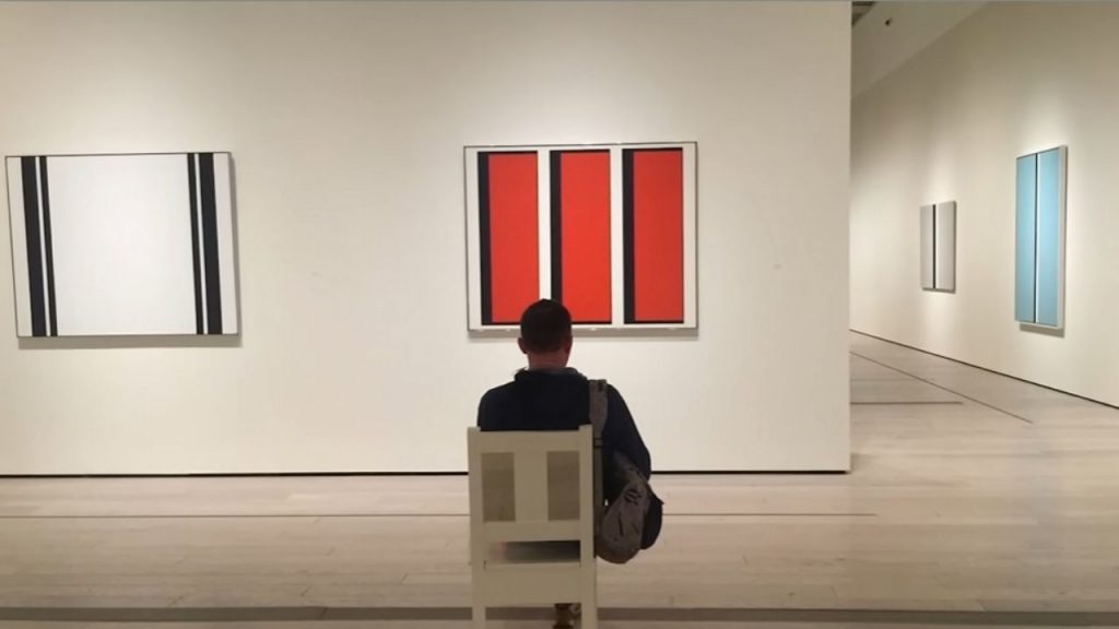
Here’s a practical exercise: spend at least five minutes with one abstract work. This might feel like forever at first, but abstract art reveals itself slowly. Notice how your perception changes as you look longer. Details emerge, relationships become clearer, emotional responses deepen. Most people look at artworks for less than 30 seconds – abstract art rewards patient viewing.
Don’t be afraid to anthropomorphize abstract elements. If those shapes were characters in a story, what would they be doing? Are they fighting, dancing, hiding, celebrating? This narrative approach can unlock emotional content that pure formal analysis might miss.
Pay attention to your physical responses. Does the painting make you feel tense or relaxed? Do you want to move closer or step back? Do you feel energized or calmed? These bodily reactions are valid interpretations – abstract art often works on this pre-conscious level.
Consider the title, but don’t let it limit your interpretation. Artists sometimes choose titles that guide viewing, other times they deliberately use abstract titles to keep interpretations open. The title is one piece of information, not the definitive meaning.
Let’s tackle some common misconceptions. Abstract art isn’t necessarily easier to create than representational art – it requires deep understanding of visual elements and their psychological effects. It’s not always emotional or expressive – some abstract art is highly intellectual and systematic. It’s not a modern invention – humans have been creating abstract patterns and designs for thousands of years.
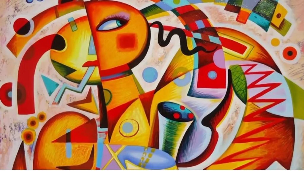
Abstract art also isn’t anti-intellectual. While it often bypasses rational thought to reach emotions directly, it can also embody complex philosophical and spiritual ideas. Mondrian’s grids represent his theosophical beliefs about universal harmony. Kandinsky’s abstractions emerged from his synesthetic experiences where he saw sounds and heard colors.
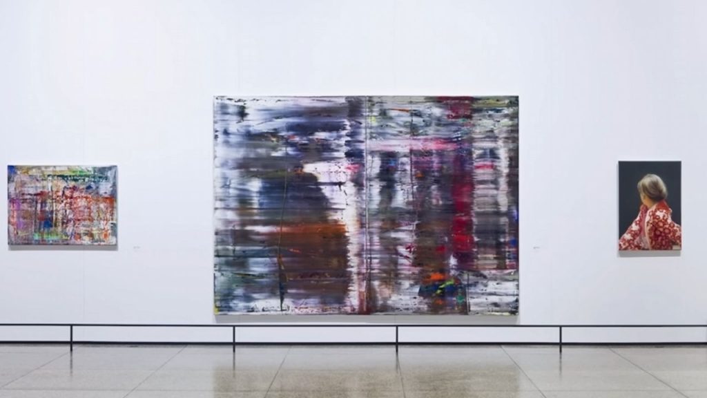
Different types of abstraction require different approaches. Geometric abstraction often emphasizes formal relationships and systematic thinking. Color field painting invites immersive, meditative viewing. Gestural abstraction captures energy and emotion through visible brushwork. Action painting records the artist’s physical movement and psychological state.
When viewing contemporary abstract art, consider what questions the artist might be asking. Are they exploring digital aesthetics? Investigating color theory? Responding to current events? Processing personal experiences? Contemporary abstractionists often work conceptually, using non-representational means to explore specific ideas.
Don’t worry about ‘getting it right.’ Abstract art is designed to accommodate multiple interpretations. Your response is valid whether or not it matches the artist’s intention or art historical consensus. The meaning you create through viewing is part of the artwork’s complete meaning.
Practice with different media. Abstract sculpture, video art, and installation work operate by similar principles but engage different senses. Understanding how abstraction works across media deepens your overall visual literacy.
If you’re ready to approach abstract art with confidence and discover the emotional and intellectual depths of non-representational work, hit that subscribe button right now and join our community of art explorers. Every week on Art Explained Simply & Quickly, we provide tools for understanding and appreciating art more deeply.
What’s your biggest challenge when viewing abstract art? Do you find certain types more accessible than others? Share your experiences in the comments below – your perspective might help others develop their own approaches to abstract art.
If this video gave you new tools for reading abstract art, give it a thumbs up – it helps more people discover these practical approaches to art appreciation. See you in the next exploration!
DISCLAIMER:
Copyright Disclaimer under section 107 of the Copyright Act of 1976, allowance is made for “fair use” for purposes such as criticism, comment, news reporting, teaching, scholarship, education and research. Fair use is a use permitted by copyright statute that might otherwise be infringing.