Have you ever looked at a painting that seems so simple, yet somehow pulls you into a deep emotional experience? Today, we’re diving into Orange, Red, Yellow by Mark Rothko—a painting that might seem like just a series of stacked color blocks, but it’s so much more. If you’ve ever wondered how a few fields of color could evoke such strong feelings and why this artwork has such a lasting impact, stick around as we explore the meaning behind Rothko’s masterpiece.
Pause for a moment and think: How do colors make you feel? Warm colors like red, orange, and yellow are often associated with heat, passion, and energy. But when you see them in Rothko’s work, they can take on entirely different meanings—sometimes calm, sometimes melancholic, and sometimes even spiritual.
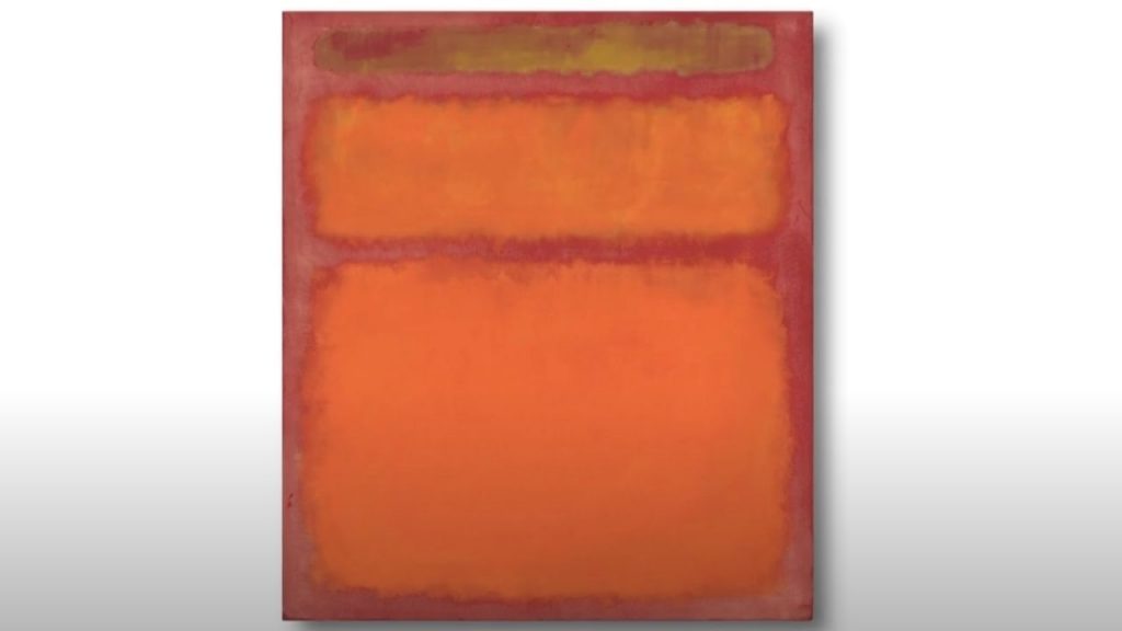
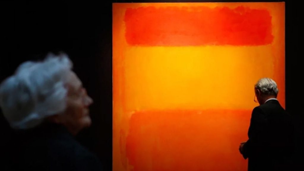
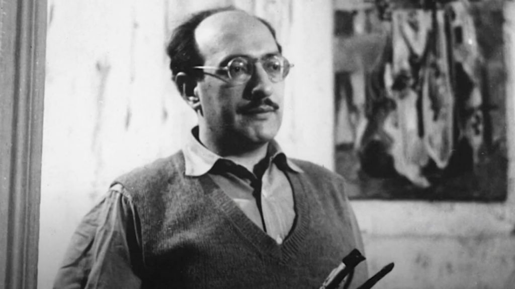
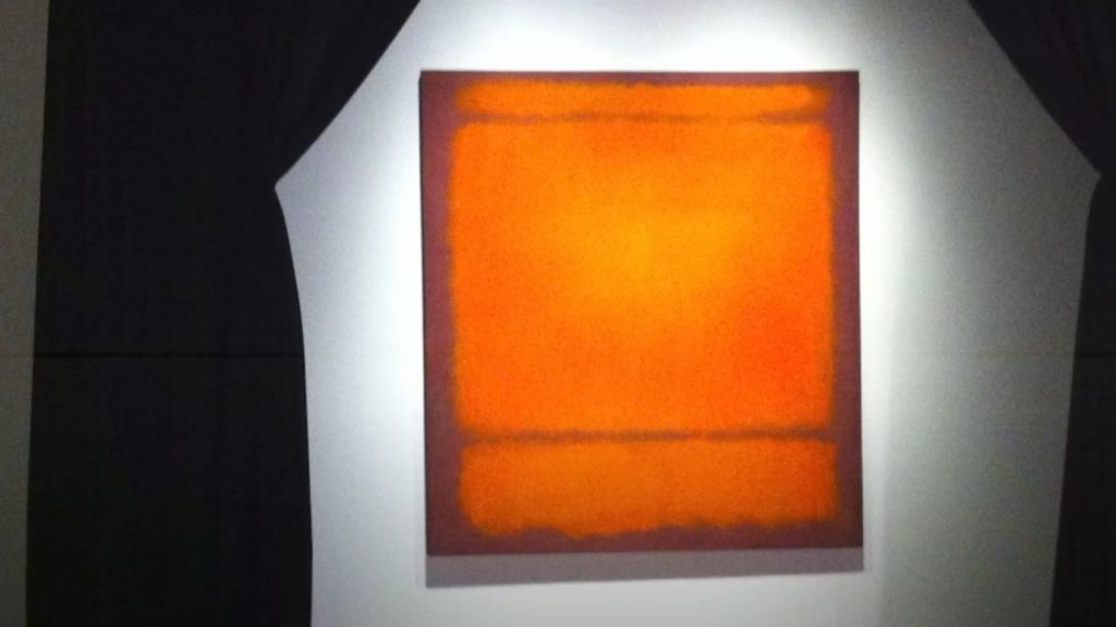
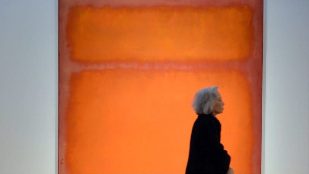
Painted in 1961, Orange, Red, Yellow is a prime example of Rothko’s signature color field technique, which he developed as part of the Abstract Expressionist movement. The painting is deceptively simple: large fields of orange, red, and yellow are stacked on top of one another in soft, hazy edges that seem to blur into one another. There are no figures, no clear narrative, and no obvious subject matter. But that’s exactly the point—Rothko’s work invites the viewer to focus entirely on color and form, allowing you to experience the emotional weight of the painting without distraction.
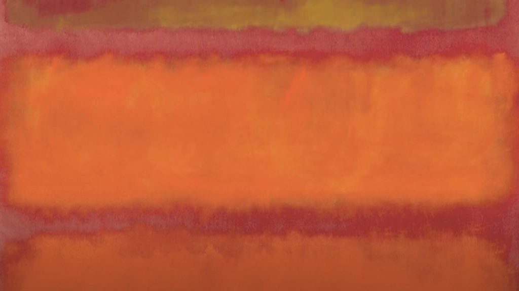
Look closely at the colors. The top section is a deep, glowing orange that blends into a more vibrant red below it, and at the bottom, a band of radiant yellow. These colors, though bold and intense, are not hard-edged; they softly melt into one another, creating a sense of depth and atmosphere. Rothko was known for applying layer upon layer of paint to achieve this effect, giving the painting a luminous, almost ethereal quality.
Ask yourself: How do these colors make you feel? Do you feel warmth and energy, or do they evoke something deeper, perhaps a sense of unease or melancholy? Rothko believed that colors, when arranged in such pure and abstract forms, could evoke deep emotional responses. For him, the meaning of the painting came from the emotional reaction it triggered in the viewer.
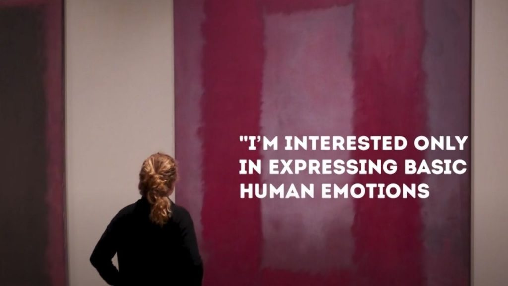
Here’s where it gets even more interesting: Rothko didn’t want his paintings to be viewed as mere decorative objects. He often spoke about his work in spiritual and philosophical terms, saying that he wanted viewers to have a personal, almost transcendent experience with his paintings. He once said, “I’m interested only in expressing basic human emotions—tragedy, ecstasy, doom, and so on.” When you stand in front of Orange, Red, Yellow, you’re not just looking at colors—you’re engaging with feelings that are universal yet deeply personal.
Let’s talk about the technique. Rothko was part of a movement called Abstract Expressionism, but his style—known as color field painting—was very different from the bold, gestural brushstrokes of artists like Jackson Pollock. Instead, Rothko worked in a more meditative, controlled manner. He applied his paint in thin washes, building up layers to create depth and softness. This process allowed him to create paintings that felt vast and immersive, as if you could step into them. It’s not just about the visual impact—it’s about the emotional space the painting creates.
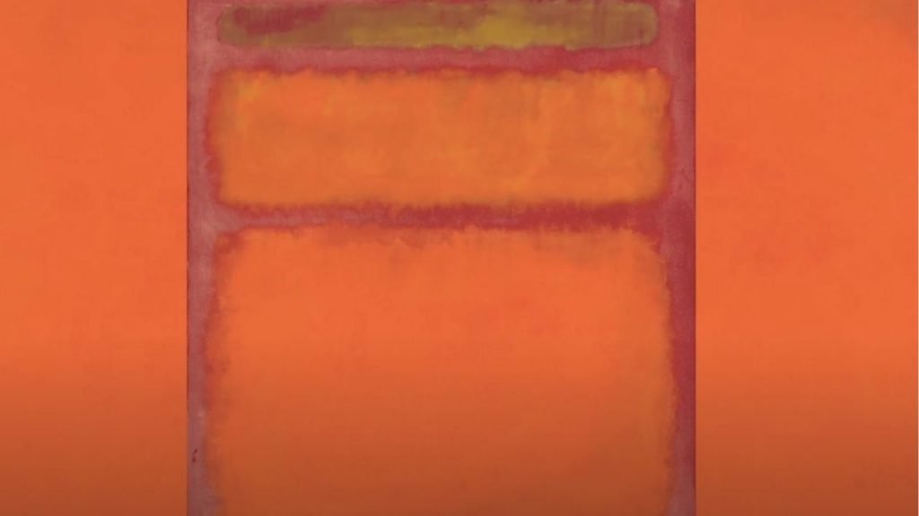
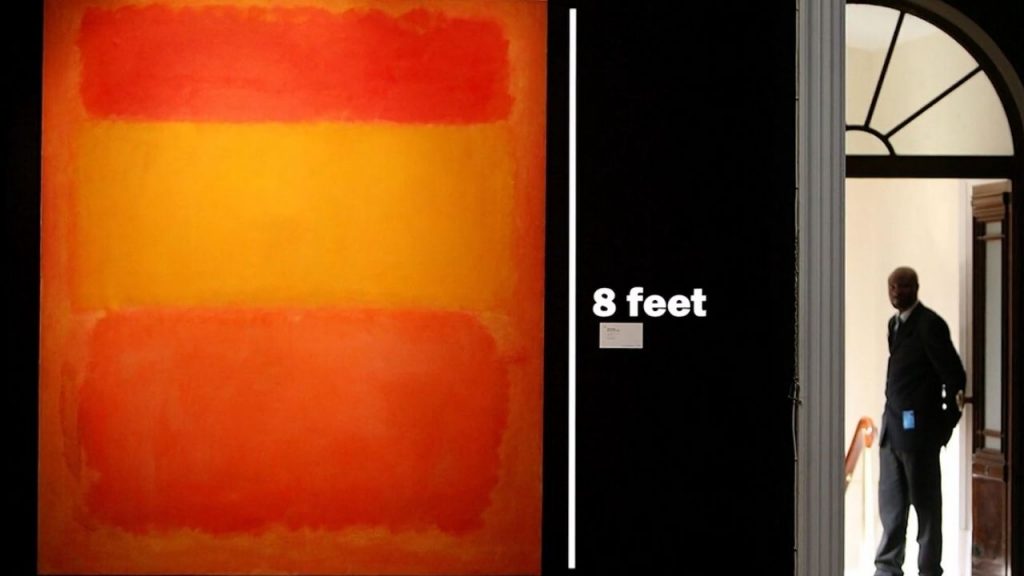
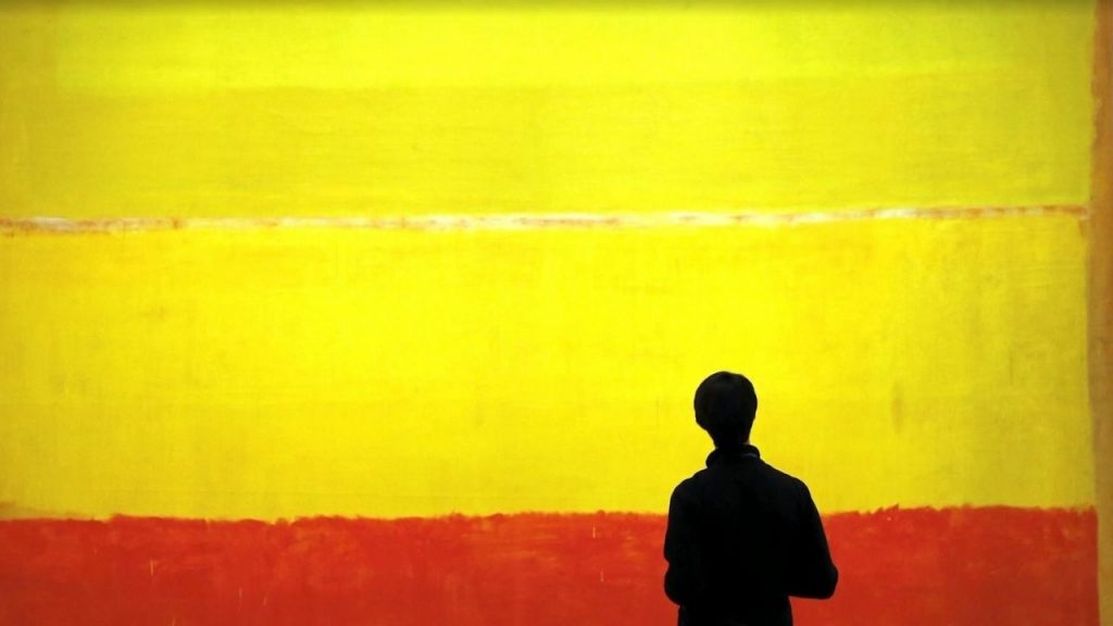
Here’s another fascinating detail: The large scale of Orange, Red, Yellow—it measures nearly 8 feet tall—plays a crucial role in how we experience it. Rothko wanted his paintings to be overwhelming, to envelop the viewer and create an intimate encounter with color and emotion. The size makes it impossible to take in all at once, forcing you to move closer and let the colors wash over you, creating a personal, almost meditative experience.
Think about this: How does the size of a painting change the way you experience it? Does the scale make you feel more connected to the artwork, or does it create a sense of awe or even intimidation?
Let’s also consider the cultural and historical context. Rothko painted Orange, Red, Yellow during a time of great change in the post-World War II art world, when artists were moving away from traditional representation and embracing abstraction. Rothko was deeply influenced by existential philosophy, particularly ideas around the human condition, mortality, and the search for meaning. His use of pure color and abstraction was his way of grappling with these big questions—creating art that was not about depicting reality but about evoking profound emotional and spiritual experiences.
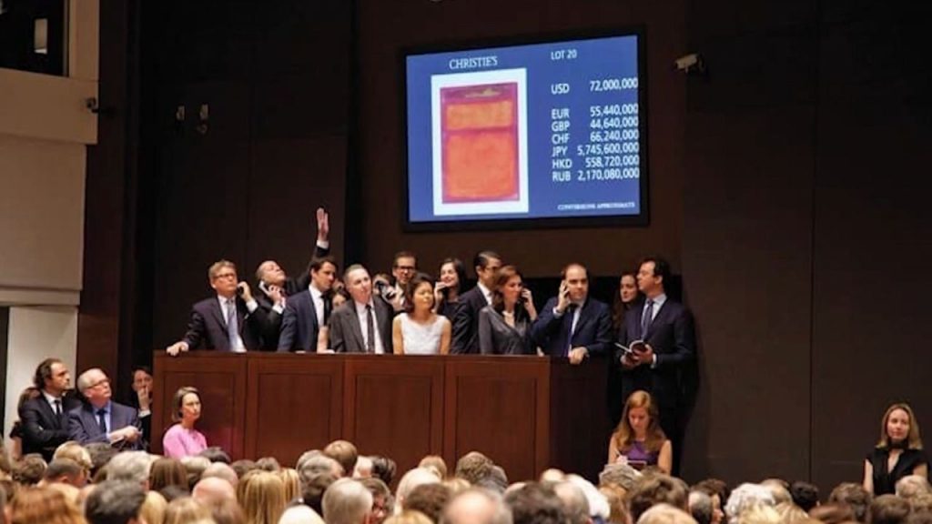
Here’s another layer to consider: In 2012, Orange, Red, Yellow was sold at auction for a staggering $86.9 million, setting a record for a contemporary artwork at the time. This sale not only reflects the enduring value of Rothko’s work in the art market but also highlights the impact his art continues to have on audiences and collectors alike. The high price tag may be surprising for what seems like a simple composition, but it speaks to the power and influence of Rothko’s exploration of color and emotion.
Try this: Next time you encounter a painting that seems abstract or simple, take a moment to consider how it makes you feel. What emotions do the colors, shapes, and scale evoke? Often, these elements are crafted to engage you on a deeper emotional or psychological level, just as Rothko intended.
So, in short, Orange, Red, Yellow by Mark Rothko is more than just a composition of bold colors—it’s a powerful exploration of human emotion, spirituality, and the capacity of art to evoke personal, profound experiences. Its scale, technique, and Rothko’s philosophy make it one of the most influential pieces of modern art, capable of stirring the deepest feelings in anyone who encounters it.
If you enjoyed this breakdown and want more art explained simply and quickly, be sure to follow this channel. And before you go, let me know in the comments which artwork you’d like to see explained next. Let’s keep exploring the fascinating world of art together!
DISCLAIMER:
Copyright Disclaimer under section 107 of the Copyright Act of 1976, allowance is made for “fair use” for purposes such as criticism, comment, news reporting, teaching, scholarship, education and research. Fair use is a use permitted by copyright statute that might otherwise be infringing.